First, who are you and what do you do?
My name is Viktor Erlandsson born and raised in the countryside in Skåne. I have been working with design and architecture for over ten years now. Running Straight Design Studio based in both Stockholm and Skåne.
In relation to a hotel project from 2016 you said that you “find colour intimidating and prefer working without”. Has this position changed? Can you explain your relation to colour today? Would you define colour as bright colours?
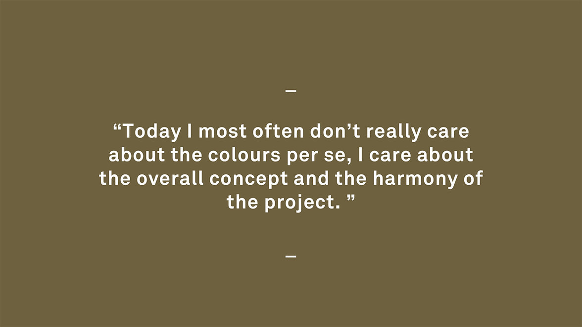
When I look back I think that was the project that made me dared to use colours in an unconventional way. Before that I rarely worked with colours at all and if I did it was very plain and sober. The concept for the project with Scandic Hotels was based on using colours and a lot of them. It made me realize that more doesn’t need to mean more. Everything around us is already coloured by the choice of material so why not work with it instead of against it? Today I most often don’t really care about the colours per se, I care about the overall concept and the harmony of the project. Colours are a big part of my daily work but so are also materials and experience.
In your work there are a lot of muted colours, grey and black. You seem to favour unconventional(?) combinations in your work, why?
I would like to claim that I favour the kind of colours that bring out the best of the product or the project that I’m working on. When working with interiors I most often favour those that are dark and muted because that’s what’s best suited for most interiors. Small and dark spaces usually gain by using dark colours. In that way you don’t recognize the lack of natural light and space. We also tend to feel more comfortable in environments that are coloured in a way that reflects nature. In Sweden - green and grey as a dark or heavy base combined with light colours of pink, blue or yellow. On top of this I also love to push the boundaries to make us feel even more.
How do you approach a colouration project?
If I work with a house I always let the house have a veto. Based on the selection of materials but also the style in which the house is built in. From that I look at what colours you find outside to reflect the area. After that I take in consideration what colours the house owners think they like. What I usually let the client decide is whether the colours should be bright or not. In a recent project the house had a lot of falu red details. From the start my client didn’t like them and wanted me to change it. My opinion was that those details were a great characteristic feature of the home so I decided to keep it and base the whole colouration on that colour instead.
How would you go about decorating a room with coloured floors?
I rarely distinguish the floor from the walls or the ceiling. For me they are all areas that need their own material or colour. The floor is a big part of the full concept and the choice of its colour is equally important as the colours of the walls.
How should we use colour in our daily life, what are the benefits?
It's quite easy. The experience of your surroundings will be much more harmonic and soft, but you can also direct the feeling or function of your surroundings by choosing the right colours, contrasts and lightness.
What is your favourite colour?
Pink! You can always add pink everywhere and still make it feel obvious.
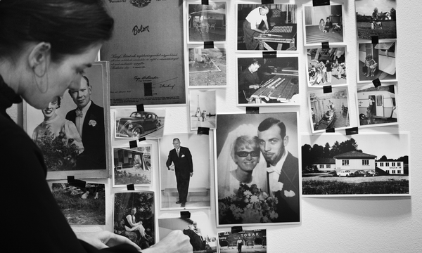
What is your strongest memory connected to (a) colour?
I have no clue. Even if I didn’t work directly with colours from the start, colours have always been something very important for me. Something that I have always been aware of.
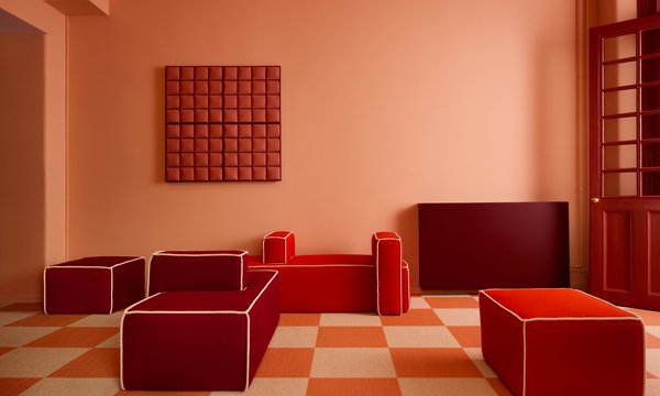
These three colours/floors are named, Fresh, Quartz and Fuchsia - what is your immediate reaction, feeling, thoughts about them?
I love the two pale ones and could easily see them in a lot of places. The fuchsia one is a harder one. It's a colour that you rarely see naturally in our part of the world. It's also a colour that often needs similarly strong colours to stabilise it.
Read more about the Artisan collection here.