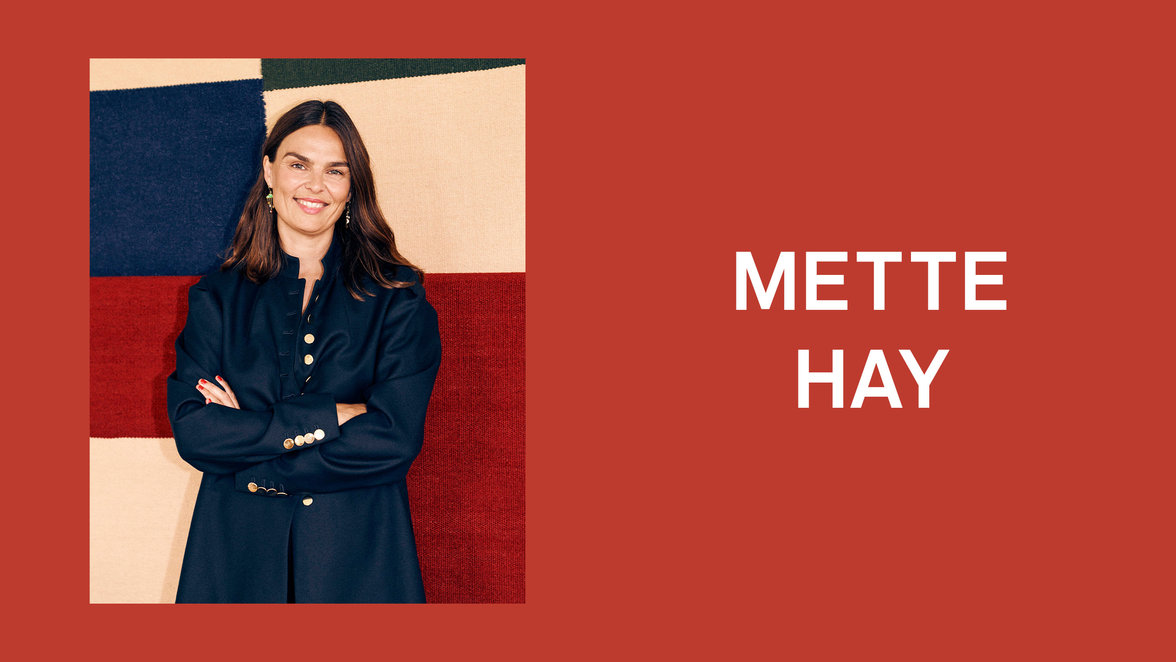
How do you approach the use of colour in your design?
- Colour is the most important tool I work with. Often enough, colour would already be an essential element of a project when we start working on it, and an integral part of the product in question.
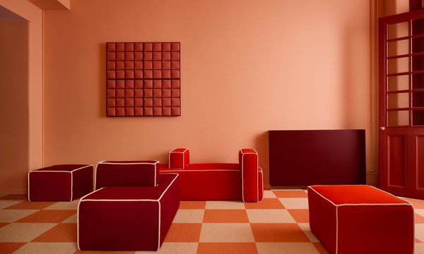
There are differences in what part colour plays, depending on the product, though. Take the Kaleido Trays by Swedish designer Clara von Zweigbergk, for example: had the collection been designed in, say, neutral shades like grey and beige, instead of the very colourful range we identified from the very beginning, I don’t think the product would have been loved as much. The colour carries the product in cases like these. Then again, if you look at a chair, this dynamic doesn’t apply very often as function and form are more defining factors.
At HAY, we don’t work with a specific colour universe for, say, a year – each project is looked at individually.
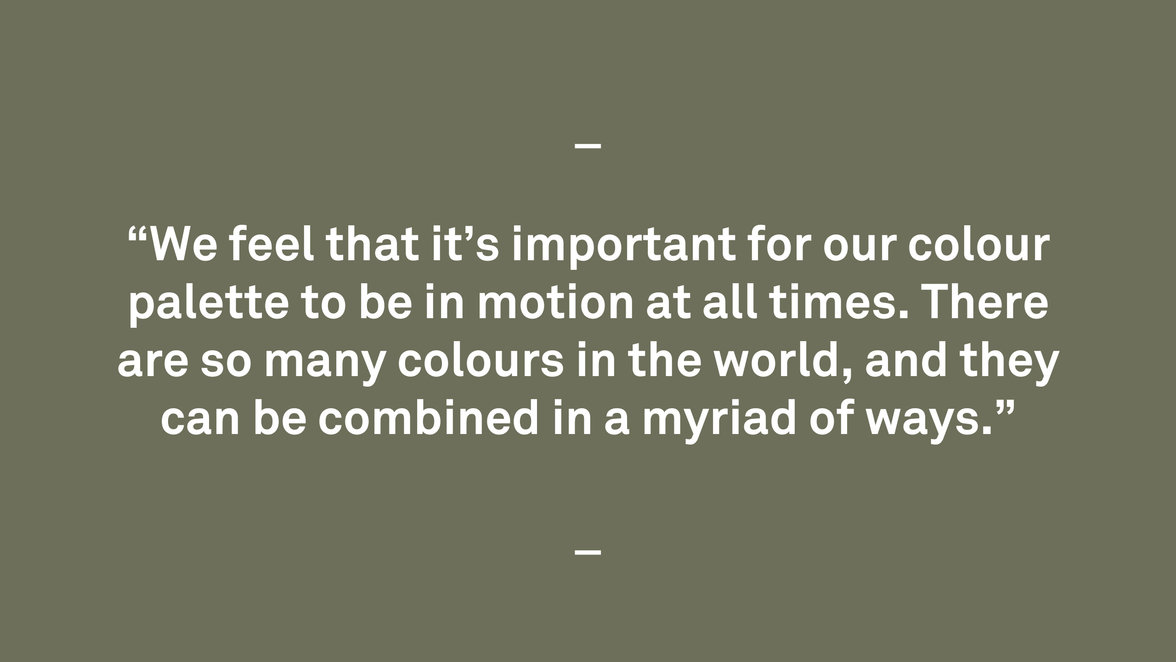
What would be the colour palette of HAY?
- It doesn’t exist, as in, it’s constantly changing! We feel that it’s important for our colour palette to be in motion at all times. There are so many colours in the world, and they can be combined in a myriad of ways. One could compare it with cooking – there are endless variations of how to combine ingredients, and depending on what a certain ingredient is paired with, it can change its character. It’s the same with colours.
That colours affect us is evident but the scientific evidence varies. How should one approach colour in life?
- Referring to what you say above: I personally don’t feel the need to have scientific proof that colour has an effect on us, because to me it does: It’s a physical sensation, similar to when the sun touches your skin. So colour means a lot to me. But it can be so different from person to person – some people wear blue jeans and a white shirt most of the days, and it feels perfect to them. It’s so subjective, and that’s great.
For HAY in general, colour is an important ingredient to our work: colour can create personality, just as art can.
What is your strongest memory connected to colour?
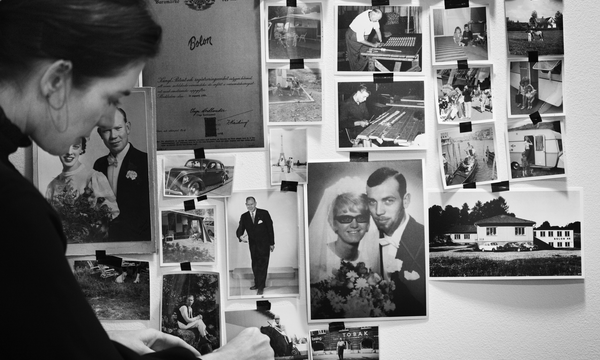
- My father had an office above the store my parents were running together – you could describe it as the equivalent to a small version of The Conran Shop – where he collected design objects. One specific piece holds a special place in my heart: The iconic Castiglioni saddle, ‘Zanotta Sella’, which had a pink pole. I remember how unusual it was to see the colour pink on a ‘serious’ object like a bike saddle at the time, and it left a lasting impression on me.
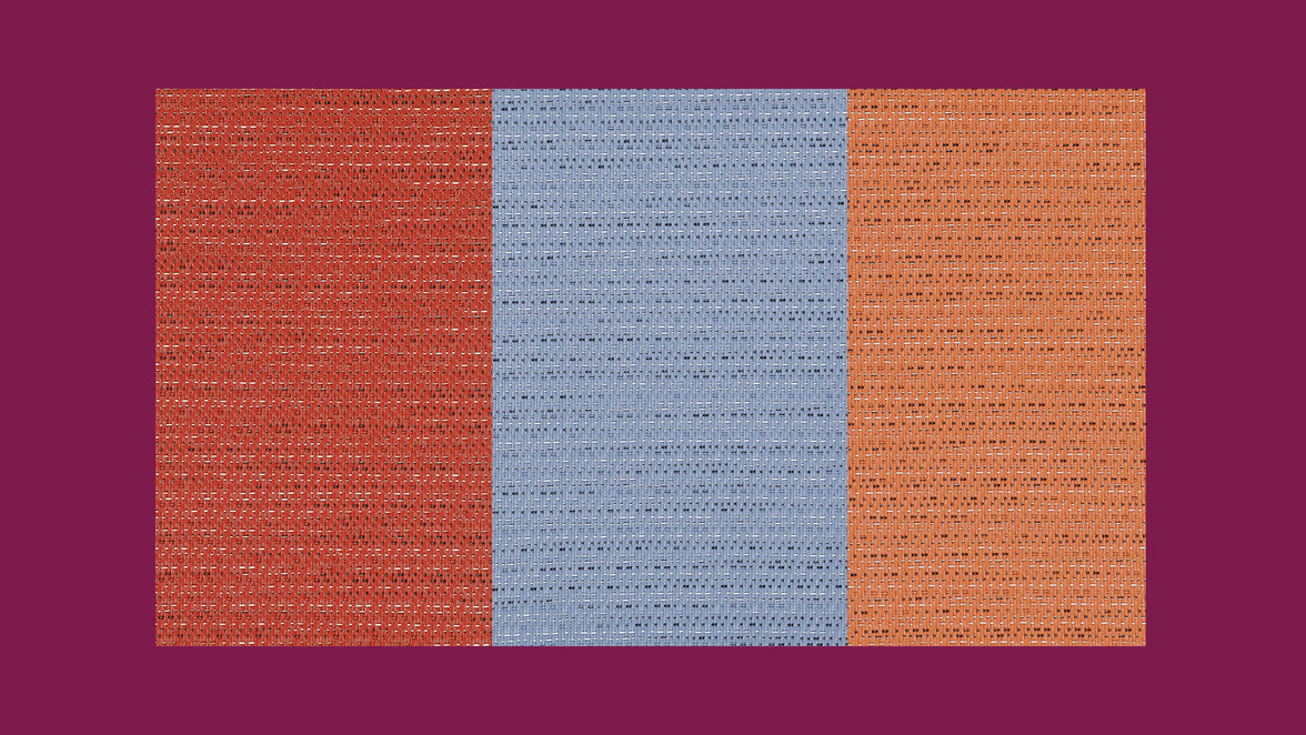
These three products from the Artisan collection are named, Love, Water and Play - what is your immediate reaction, feeling or thoughts about them?
- Perhaps it’s because Italy is my favourite destination for the summer holidays, but I immediately think of Italian summer and the sun-bleached parasols you see sprinkled all over the coasts. So the sentiment is warm, joyful, pleasant.
And perhaps the most important question: what is your favourite colour?
- I have many! But if you ask my children, they would probably say yellow.