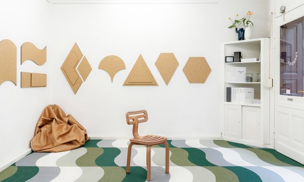
This is a base collection of new neutrals that can handle change, movement, as well as endless vision. We’ve found that perfect balance giving six new neutral colours real character and structure. Together, the threads in both warm and cold shades create the colors of change we aim for with this collection. The inhouse team, focusing on research and development, is led by Bolon CEO Marie Eklund and together with Lisa Jarhult and product developer Cathrine Ahlenius they have developed a collection, bursting with identity. Cathrine Ahlenius has been with Bolon since 2017 and knows a thing or two about the importance of well designed products and creative processes.
What does the design process look like?
A cycle for developing new products can vary in time depending on the type of project or product we work on, but most often we start the research process at least 12-15 months before launch. When designing Emerge we started by researching natural materials found in modern architecture. We looked at tones in wood, metals and stone, clay, concrete and composite material such as Terrazzo. We also looked at architectural glass, fibre and paper. We created texture and colours that complement these architectural materials, as well as complement our existing collection.

What is the most intriguing part of the Emerge collection?
I love how using different accents in combination with a neutral colourway in Emerge can give the product a whole new context! The mix of warm and cold tones in the colourways of Emerge makes it a perfect base for other colours in an interior setting. Emerge can also work as a bridge between groups of colours -both tone in tones and accents.
In relation to the existing products in the Bolon portfolio, what is the reason to be for Emerge?
Emerge is a base collection consisting of neutrals with very strong colour identity, perfect for large architectural spaces. They are not your standard beige or standard grey but complement these in our existing collection.
The products are named by movements such as Ripple, Arise and Drift, why?
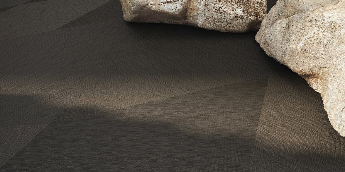
The neutrals in Emerge are not passive or basic -their names accentuate that they are active, and each have a strong colour identity. When viewing the floor from different angles the colour shifts from cold to warm and back -movement as illustrated in their names!
When looking forward, what trends do you see in the future and what will define 2021?
We will dare more! 2020 has been full of scare, constraints and missed opportunities. As we enter 2021, we are thankful, eager, hopeful, and will load our interiors accordingly. In terms of colour this will be reflected in more allowing mixes of tones from different spheres -from warm and cold, neutral and contrast, old and new -eclectic in a well curated way rather than focus one or a few isolated trend colours. The base will be warmer, and we will see soft dark alternatives to black.
In general, what trends will dominate and why?
I believe we will see two opposites when it comes to surface texture -on one hand gloss, hard, shiny and flat surfaces reminiscent of what we meet on screen and on the other hand hyper textures, coarse and irregular surfaces that are highly tactile. The need for tactility and physical sensation grows as we have lost so much of it during 2020. We will continue choosing less but better, more sustainable and long lasting regardless if we are considering clothes, objects or colour.
Read more about the Emerge collection here.
