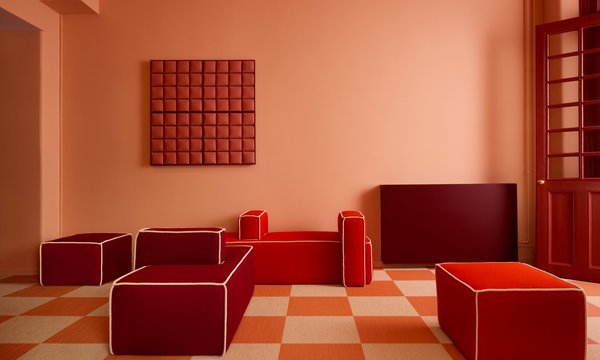
For the curious at heart, colours can be so much more. Colours make us feel, think and dream. The R&D department at Bolon, responsible for design and development of products, was tasked with making the classic Artisan collection more complete. The result is a collection where the eye travels effortlessly from colour to colour, each one with its own identity, vibrating with joyful energy. We sat down with Head of R&D, Cathrine Ahlenius and product developer Lisa Jarhult.
What is the new Artisan collection?
Cathrine: Artisan is a lively and energetic collection – characteristics that are now enhanced. Artisan has a beautiful balance between the colours of the warp and weft as well as structure. New Artisan has a strong identity, with colours offering more possible combinations both within the collection itself and with other products by Bolon.
Lisa: The collection is more confident with new additional colours – making this classic collection more complete. The product is just as sustainable and reliable as before. Now, both trendy and timeless depending on the combinations of colours or shapes.
In the expansion of this collection you’ve worked with something called “colour friends”, what is that and why are certain colours more harmonious than others?
Lisa: There are different types of “colour friends'', they relate to each other just like we humans do to others. Colour harmonies, as these relations also can be called, can be attracted to each other either through likeness or by their opposites. Such as complementary colours from opposite sides of the colour wheel. In theory the extreme complementary colours are red-cyan and magenta-green. Harmonies can be groups of colours on the same scale, nearby tones gradually shifting in darkness and brightness.
Siblings can also match, for example a more saturated colour with a less saturated colour; Artisan Jade and Artisan Fresh are good examples of siblings. Several colours can in combination create balance and harmony; a loud colour being challenged by a wild card or balanced by a darker colour base or toned down with a light colour. Some harmonies are just mysteriously good looking next to each other!
To you as designers, colours are of great importance. Although the perception of colour is profoundly subjective; why do you think colour makes us feel things?
Cathrine: The importance and effect of colour lies deeply rooted in our brains since prehistoric time. Throughout evolution colour has been a tool of survival. It helps us develop and stay healthy. Colours tell us when the fruit is ripe, which plants and animals are poisonous, and when the weather is changing for better or worse. Colour can make us alert or relaxed. Our brain reacts first to colour, and then to pattern or texture. The fact that colour can evoke emotions and associations, lead towards new experiences and form new context, and even provoke, are all abilities that are important tools for me as a designer.
Lisa: My own ideas regarding this are that emotions arise from all our senses; sight is one of them with the ability to translate colour into sentiments. Making the actual energy radiating from the different wavelengths real. Colour stimulates our different memories, and in turn that memory will evoke the feeling connected to those specific events and circumstances! How the colours are combined also matters for which memory will appear. Intense or soft colour doesn’t really make a difference, the emotions will occur as they are. Subconsciously developed memories are attached to different colours, traditionally these symbolizes very different expressions.
The Artisan collection is a splash of colours, enabled by versatile vinyl. How does this flexible material affect the colours?
Cathrine: The texture and colour of the thread in combination with the woven structure is what gives the design its character. But since our flooring isn't flat the light and surrounding interior materials also influence the experience. By using colour, we can direct an experience; exaggerate the shine of vinyl making it feel high-tech or choose to emphasise the material’s softness and tactility.
What’s the best advice regarding selecting a colour for flooring?
Cathrine: The floor often takes up a large area of the total interior and it is easier to dare using lots of colour there rather than on walls. This is simply due to how the product meets the eye differently, horizontally rather than vertically, the physical distance and how the area of colour is broken up by other interior elements. Technical aspects such as area of use and cleanability also need to be considered. A graduation of colour through a larger area can help people orientate within the space. The choice of colour also affects the level of light reflection. Flooring has both a physical and visual impact on the total ergonomics of a space – making it an intriguing and significant product. In general – dare to be bold!
Lisa: Except for the practical or technical instructions, well… Think less, go with the gut. If it feels good, it is good!
Explore the full Artisan collection here.